
UX Implementation for NetElixir's LXRInsights AI Dashboard

"Redesigned the LXRInsights AI dashboard for a real client (NetElixir) — 100% of test users preferred the redesign over the current product."
Project Information
Role: UX Designer, Design & Prototyping Team
Project Type: Client Externship Project — Rutgers MBS Externship Program in partnership with NetElixir, an AI-first digital marketing agency
Timeline: 12 weeks (Fall 2025)
Tools: Figma, Google Forms (A/B testing survey), Miro
Overview
LXRInsights AI is NetElixir's marketing analytics dashboard for eCommerce companies. Working directly with NetElixir's Product Marketing Manager as our client stakeholder, our team was tasked with improving the platform's usability, specifically around two features users found confusing: the Experiments tab and Product Analytics.
Design Focus
Simplifying navigation, clarifying data visualization, and validating every change through real usability testing before recommending it to the client.
The Problem
Users found the LXRInsights AI dashboard difficult to navigate and confusing. Key features like the Experiments tab and Product Analytics were not intuitive and often required manual assistance to use, creating friction that got in the way of platform adoption.
The Goals
Simplify UI/UX and improve overall dashboard usability
Enhance clarity and accessibility of complex features like Experiments and Product Analytics
Validate redesigns through usability testing and high-fidelity Figma prototypes to deliver actionable UX recommendations
Enhance onboarding with step-by-step guidance
Process
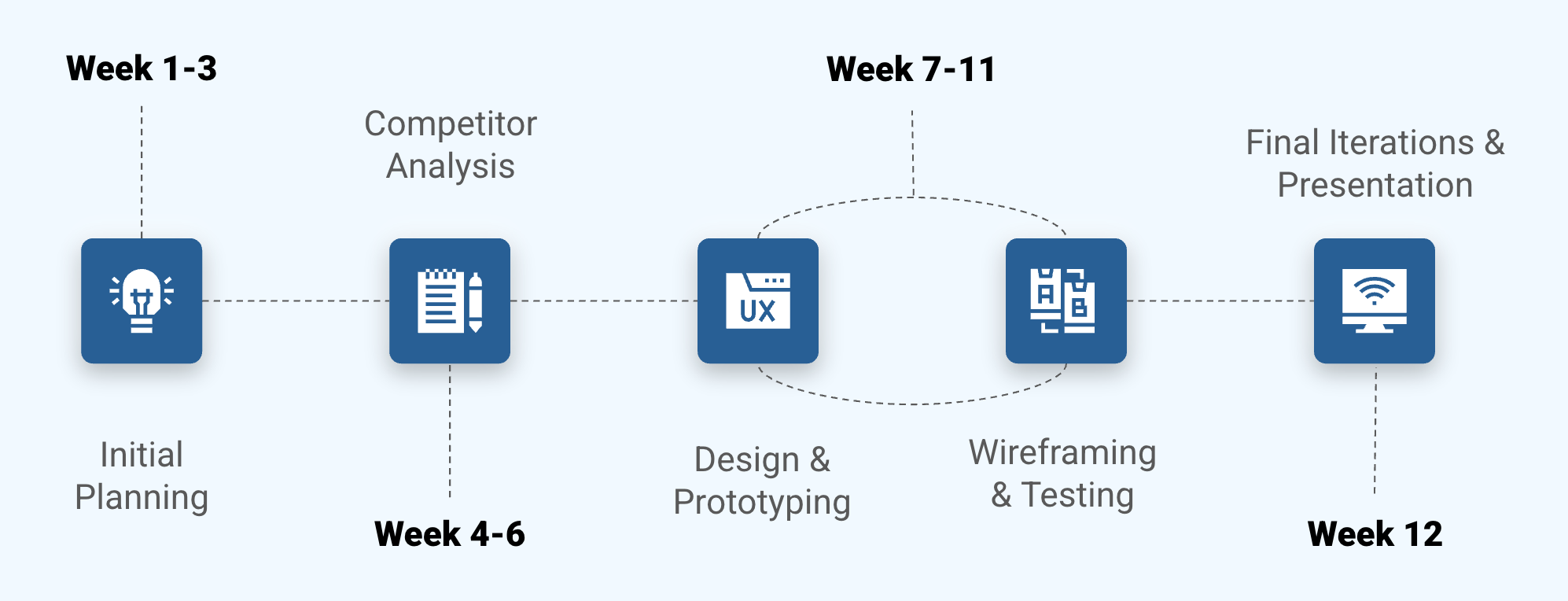
Our 12-week engagement moved through five phases: initial planning, competitor analysis, design & prototyping, wireframing & testing, and final iterations.
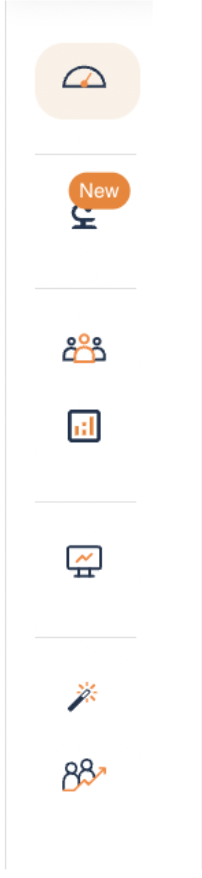
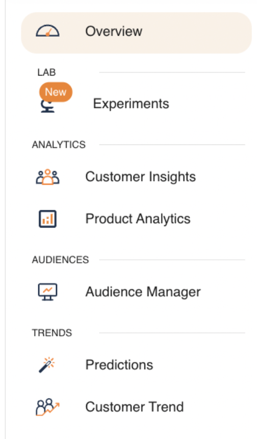
After:

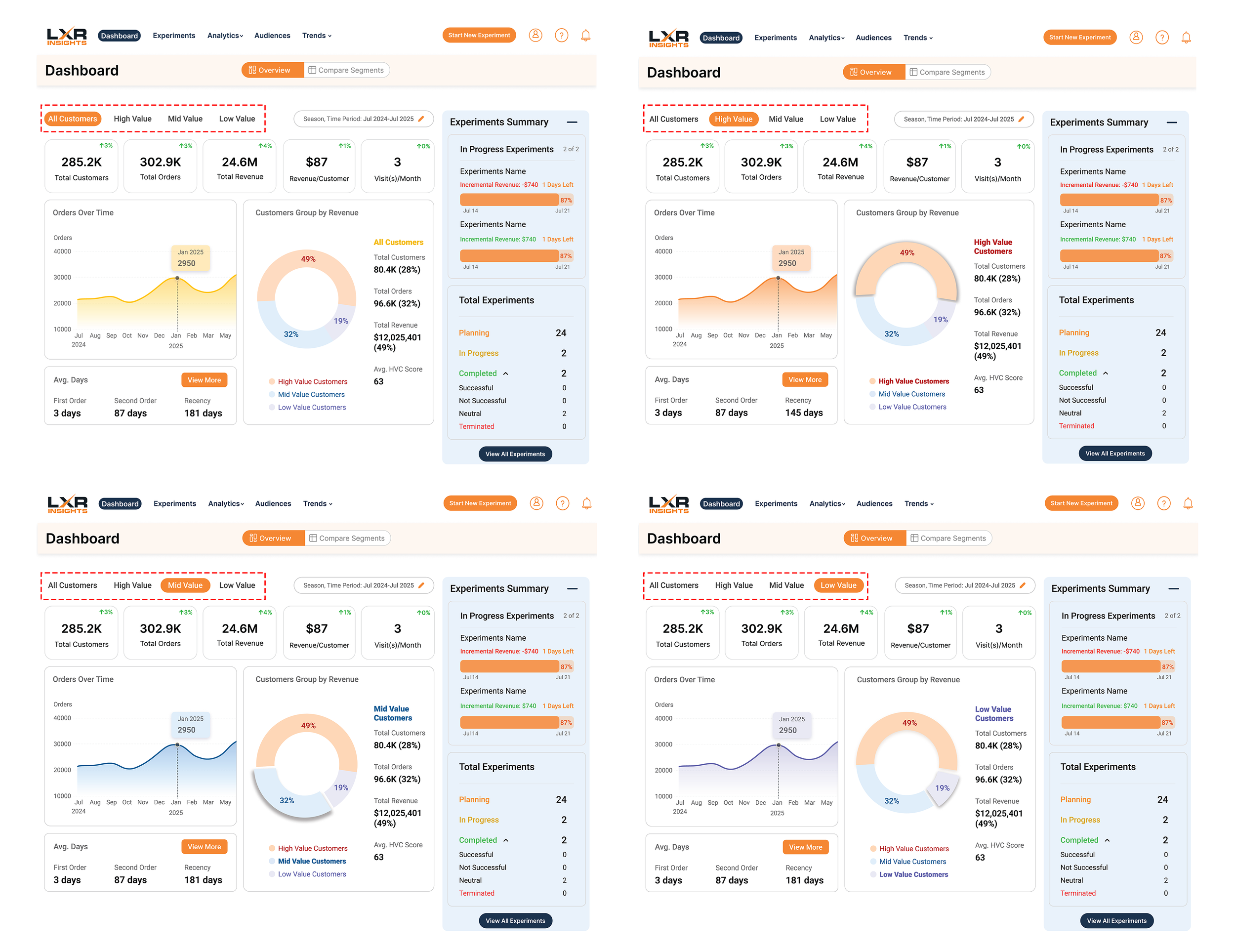
Overview Page: Customer Segment Display
Purpose: Reduce visual overload from long, scrollable pages stacked with graphs, and help users find segment-specific insights faster.
Solution: Displayed one customer segment at a time, with buttons at the top to switch between segments. We also adjusted the chart's color palette, swapping grey for purple, so an inactive-looking segment didn't read as literally inactive, and checked every color choice against Adobe's Contrast Color Checker for accessibility.
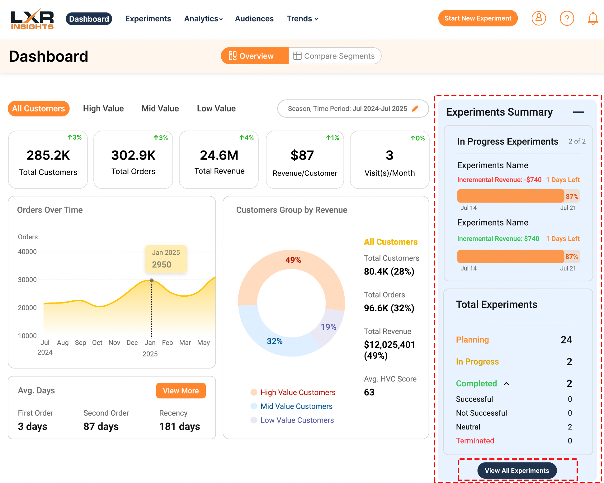
Overview Page: Experiment Summary Module
Purpose: Let users understand experiment progress at a glance, without navigating away from the dashboard.
Solution: We prototyped two directions and tested both. Version A added a collapsible right-side summary panel displaying status, revenue, and key metrics, along with a "View All Experiments" button. Version B placed a full-width Experiment Summary section below the main graphs. In testing, users significantly preferred Version A's more consolidated, side-by-side view.
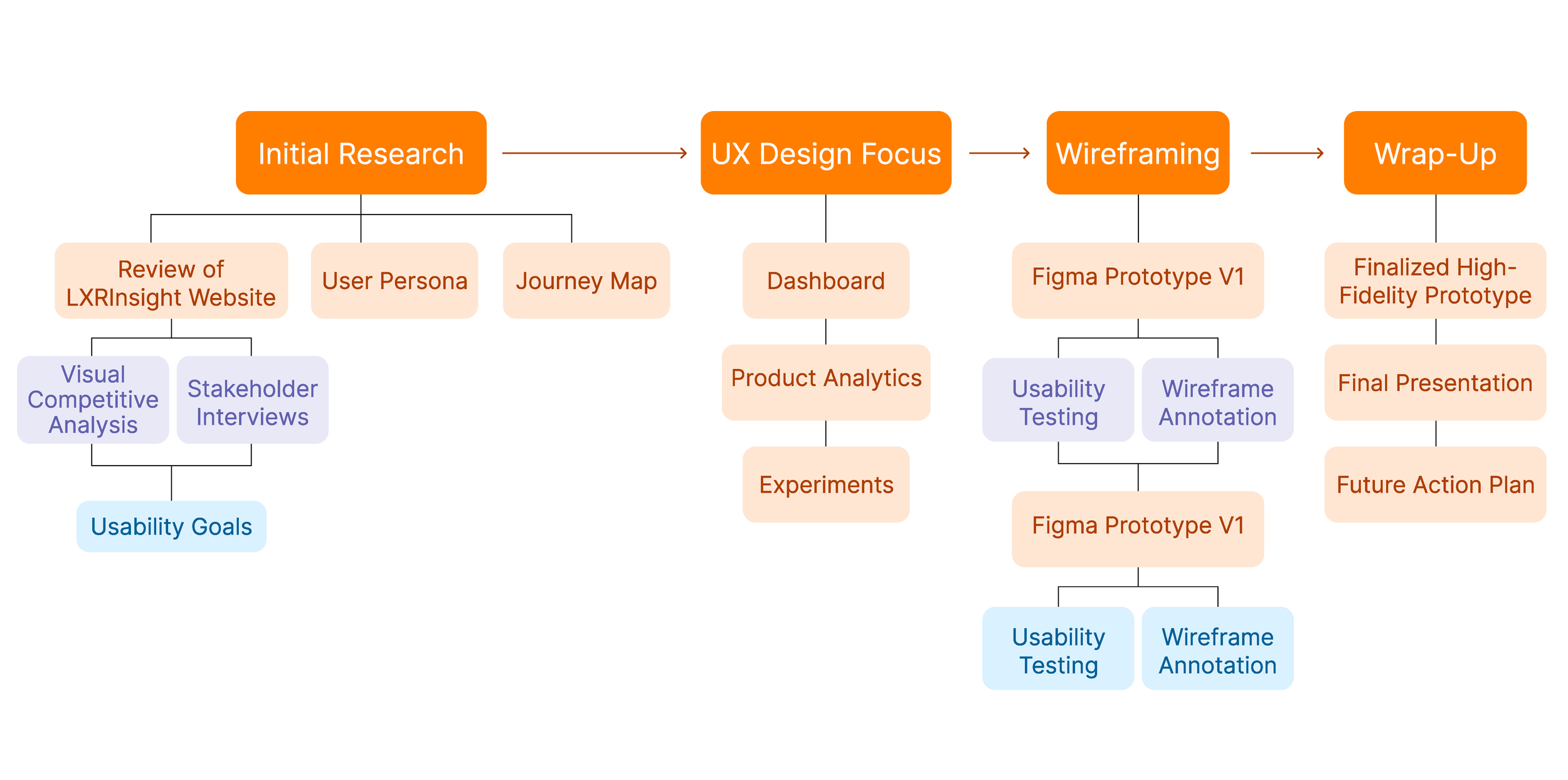
We began with a full review of the existing LXRInsights website, visual competitive analysis, and stakeholder interviews to define clear usability goals. From there, our team split into two tracks working in parallel: UX Research & Testing and Design & Prototyping, the team I worked on. Each design decision moved through two rounds of Figma prototyping, each validated with usability testing, before we finalized it.
Design Solution
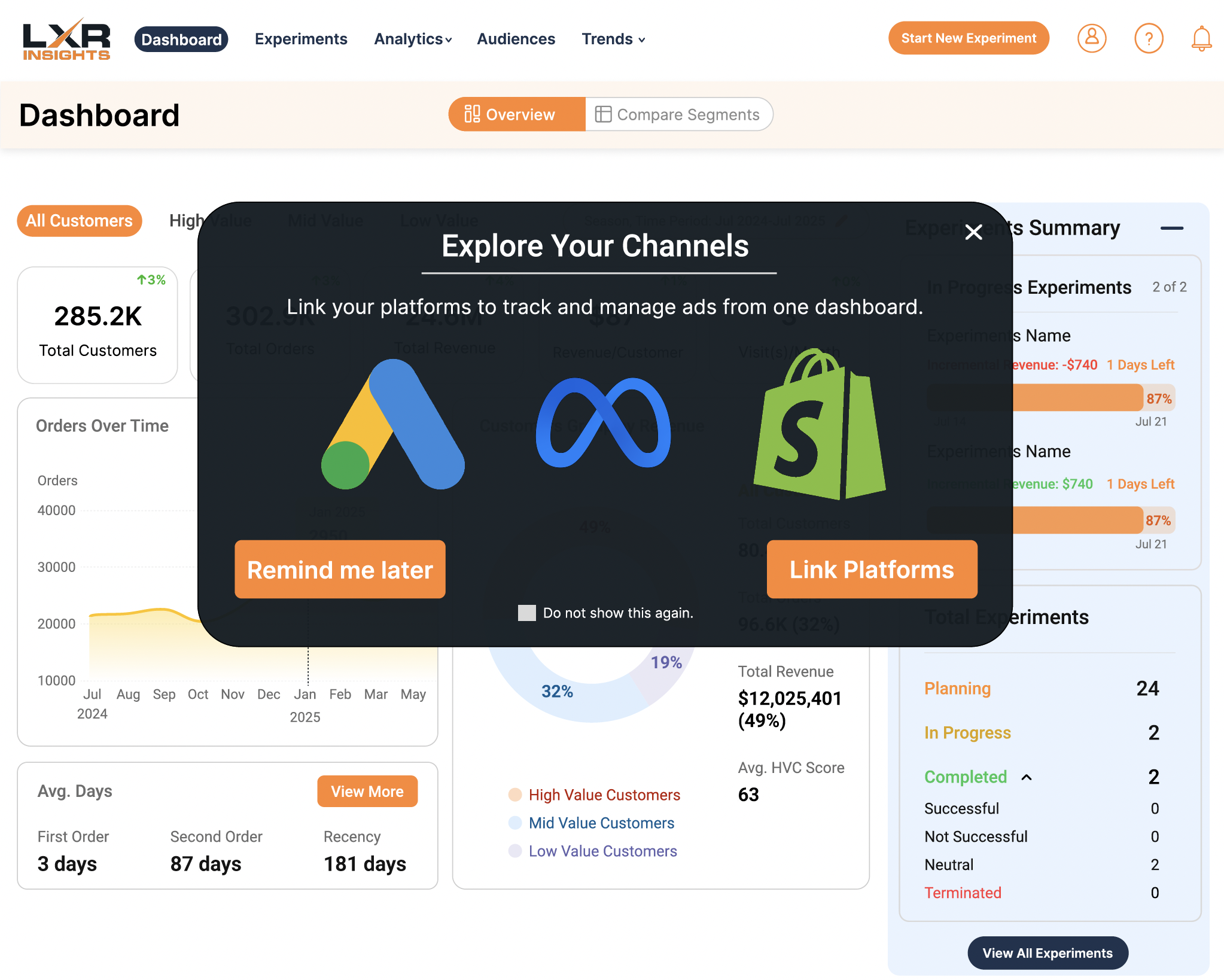
Onboarding: First-Time Login Pop-Up
Purpose: Encourage users to link their Google, Meta, and Shopify accounts early — without adding friction to onboarding.
Solution: Added a first-time login pop-up prompting users to link their platforms, with a "don't show this again" control to prevent it from becoming annoying.
Navigation Bar
Purpose: Improve navigation clarity and make core pages easier to find by removing a hidden, hover-dependent menu.
Solution: Moved sidebar navigation into the top bar for a cleaner hierarchy, and increased contrast on inactive links for accessibility.
Before: